Rodo Sans
A typeface designed for road signage with legibility in mind.
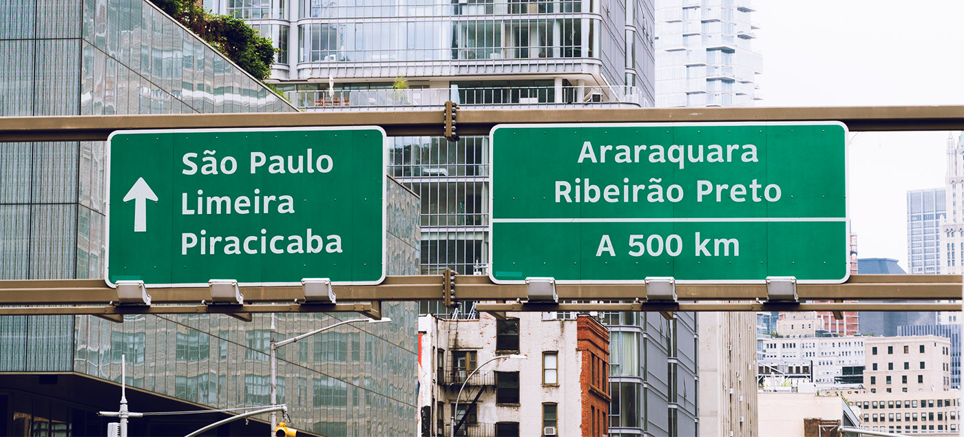
Rodo Sans is a typeface project that started as my bachelor’s thesis, focused on making road signage more comfortable to read and allowing a sense of unity across signs in a particular highway or country. For the MVP, the idea was to focus on the Brazilian Highway System. However, the final goal is to fully design a typeface that could be adopted in any country that uses the Latin/Roman alphabet as its official script.
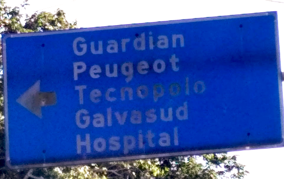
The idea of this project was set about after I noticed a lack of integrity in the road signages in my city. Every sign was set in a different typeface, weight or size — and all this discrepancy impacts their legibility and visual comfort.
According to the Brazilian traffic code, there are three authorised typefaces for road signage: the so-called Highway Gothic, Arial Rounded and Helvetica. Out of those three, only the first one was designed specifically for distance reading, but it was created in the 1930s with little scientific research on legibility available at the time.
In short, the biggest challenge was designing a typeface for better legibility for distance reading while remaining accessible to anyone who wants to use it.

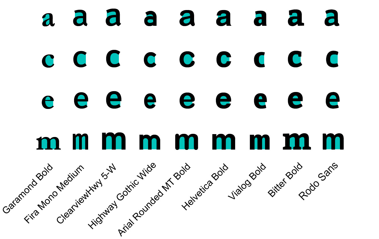
To understand what affects legibility in a typeface, I recurred to a few scientific papers on this topic. The critical aspects of the research were the importance of inner letter counters and the overall x-height of a typeface. Both features notably impact legibility, especially under low visibility conditions.
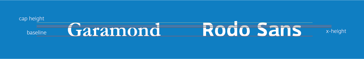
Even though both typefaces have the same cap height, one appears to be bigger than the other due to the x-height difference.
Another point was observed after analysing the Brazilian traffic code and all its specifications. It was clear that it could easily cause some cognitive overload to people who are not familiar with the terminology. It might even explain why there are so many road signages set in Arial, given the fact it’s the most widely available font.
The best way to understand the area of improvement is by looking at what has already been made. Some typefaces chosen during the analysis were explicitly designed for road signage, such as Clearview, Highway Gothic and Vialog. Others were designed for short/medium distance reading, like Arial rounded, Helvetica and Garamond.
It was possible to notice that the fonts with higher x-height and more expansive inner letter counters looked relatively easier to read. However, this first observation was purely based on my own experiences.
To get a neutral perspective on the topic, I conducted a survey divided into two parts: one focused on qualitative data to get more insights from the respondents, and the other focused on quantifying the reading performance in 6 related typefaces under four different viewing conditions.The form was spread through online focus groups on Facebook and received 47 responses. Some of the main insights extracted from this survey were:
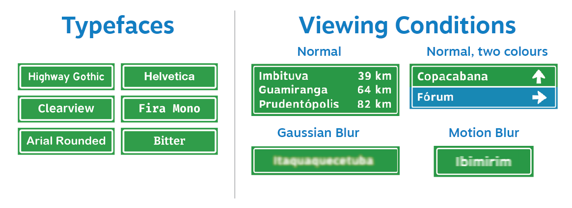
Each quantitative question had 6 sign, one for each typeface; the name of the typefaces were not given during the survey.
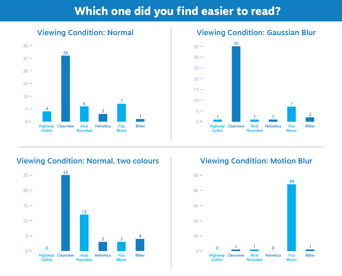
Clearview was the most resilient to the different viewing condition.
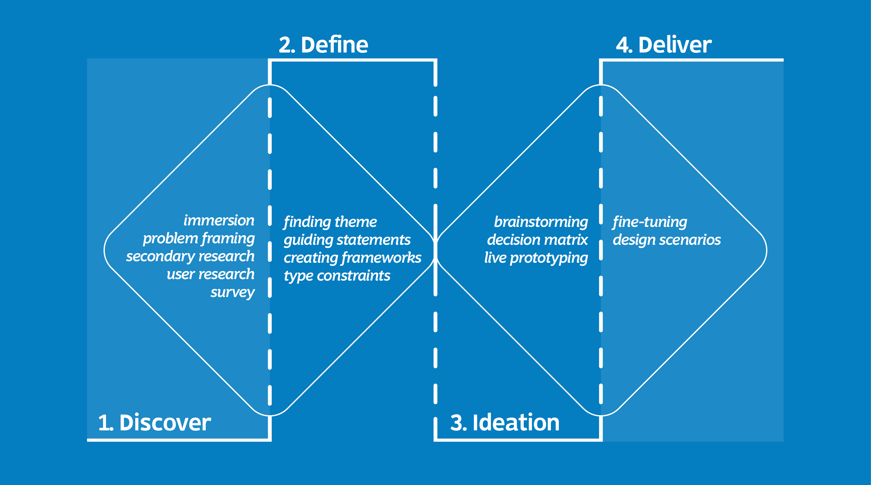
Once I gathered enough data, I started to reframe the problem and put together a strategy to solve it within the deadline. I had only three months to design the typeface and validate it in time for the project’s final presentation.
I settled on creating an MVP for the typeface, which would be enough to get valuable feedback during the validation phase and still fit the time frame. The overall goal for this MVP was to out-perform the legibility score of the three “official” typefaces used in road signage in Brazil.
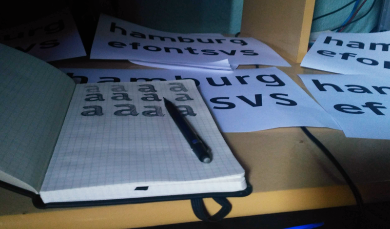
A solution doesn’t happen right off the bat. It can take time and a lot of iteration and analysis. First, I started to brainstorm some ideas for individual letters — not the entire alphabet, but just enough letters that could capture the “DNA” of the typeface. Once I was out of ideas, I scrutinised every sketch, focusing primarily on legibility.
Having selected the main concepts, I started to draw the letters on Fontlab. The first letters to be digitalised were the ones I had already drawn on paper which set the “genetic code” for all the other letters. During this stage, I also found it helpful to print out some words and phrases using the letters I designed so it would be easier to fine-tune their shapes.
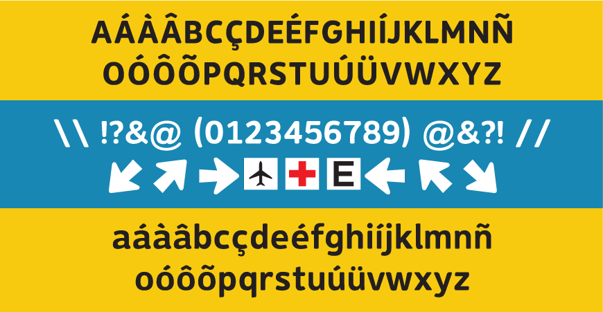
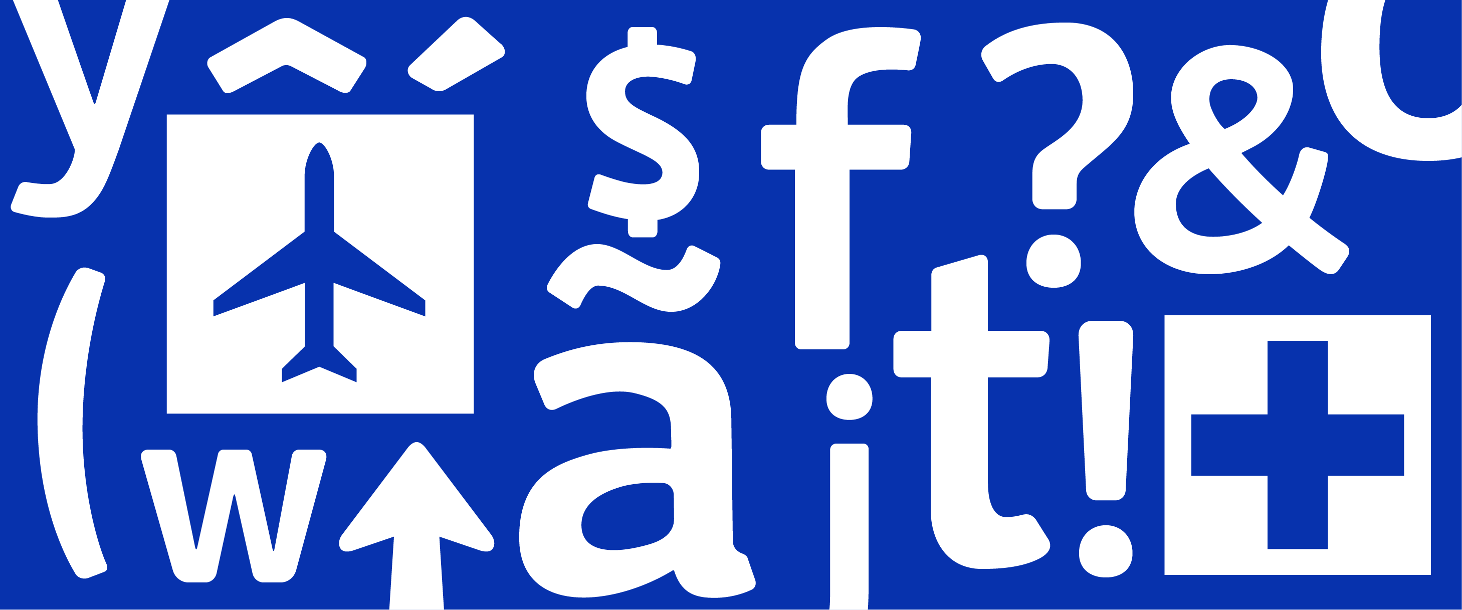
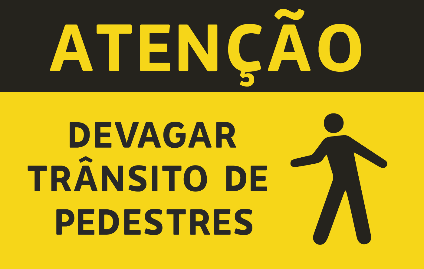
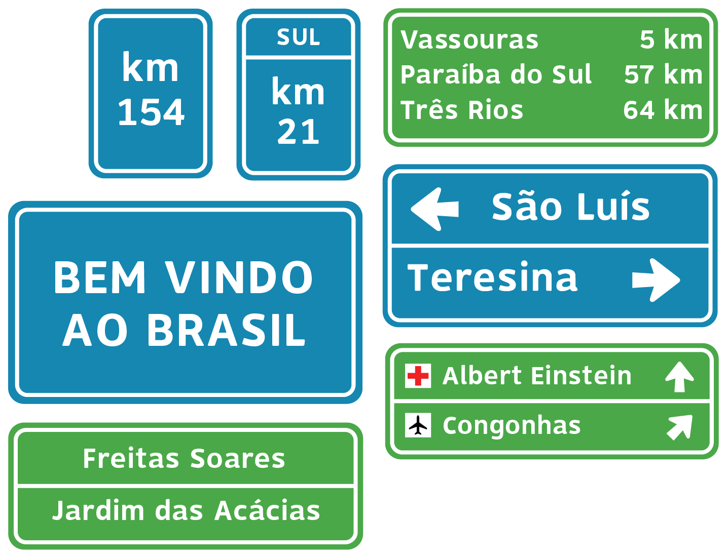
The Brazilian traffic code has its set of signage symbols based on the Vienna Convention. Creating a sign with one of those symbols is troublesome as you have to get the illustration vector elsewhere. To make this process easier, Rodo Sans has an OpenType feature that replaces the symbol ID/code for the actual symbol. Since the size of a symbol is proportional to the size of the letter, there’s no need to resize it.


The validation phase took shape through a second survey. The participants were asked to mark the signage that appeared to be the most legible in each condition. The signs were set in four different typefaces, including Rodo Sans.
The survey had 33 replies with roughly the same demographic as the previous one. The result showed that the research and the method were accurate enough to deliver the best outcome among the four typefaces in every condition. Therefore, the MVP demonstrated effectiveness and made room for future developments of a complete (variable) type family.
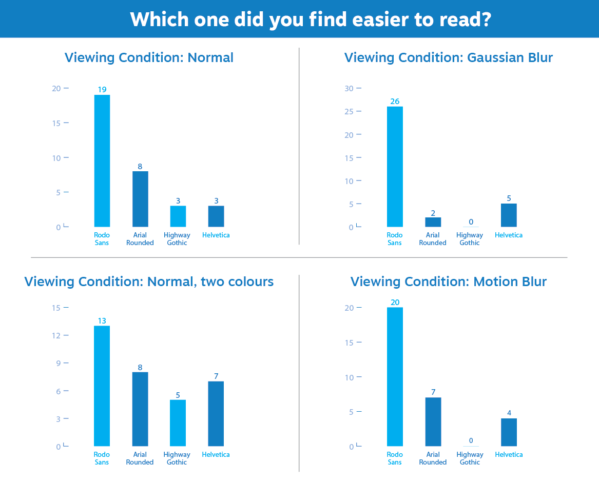
Rodo Sans outperformed the other typefaces under all conditions by a significant margin.
It was the first project I spent roughly 2/3 of the time on the research phase, which indeed paid off. I believe I wouldn’t have gotten such a result if it wasn’t for everything I learned during this stage.
The word iteration is quite popular in the tech industry, but I was surprised to find its importance in type design. The typeface underwent many changes during its genesis to make every character feel like part of the same family.
We’re always so focused on the positive spaces that we end up not giving enough credit for the “empty spaces”. During this project, I fully understood its importance, especially in typography. Noticing the white spaces became a skill that has prooved helpful in other projects.
The most important next are the variations in width and weight, so the typeface has the flexibility it needs to perform well on any signage. Other than that, it’s also relevant to conduct a more accurate test to evaluate its legibility. Since the project took part during the pandemic, I couldn’t do any on-site validation due to social isolation restrictions.